Sky Child Care
(Spin Systems)
The mother of one of our developers was the administrator of a child care center. Her day-to-day tasks included the managing of paperwork regarding, sign-ups, financials, health records, etc. As you can imagine, this is a LOT of paperwork!
Her son saw this as an opportunity for our company to alleviate her burden by making these tasks web based. With buy-in from management, we researched, designed and developed a product from scratch.
My Roles
UI/UX and Brand Designer, Wireframer, Researcher, Front-End Coder
Tools and Technologies
Pen & Paper, Photoshop, Illustrator, Sublime
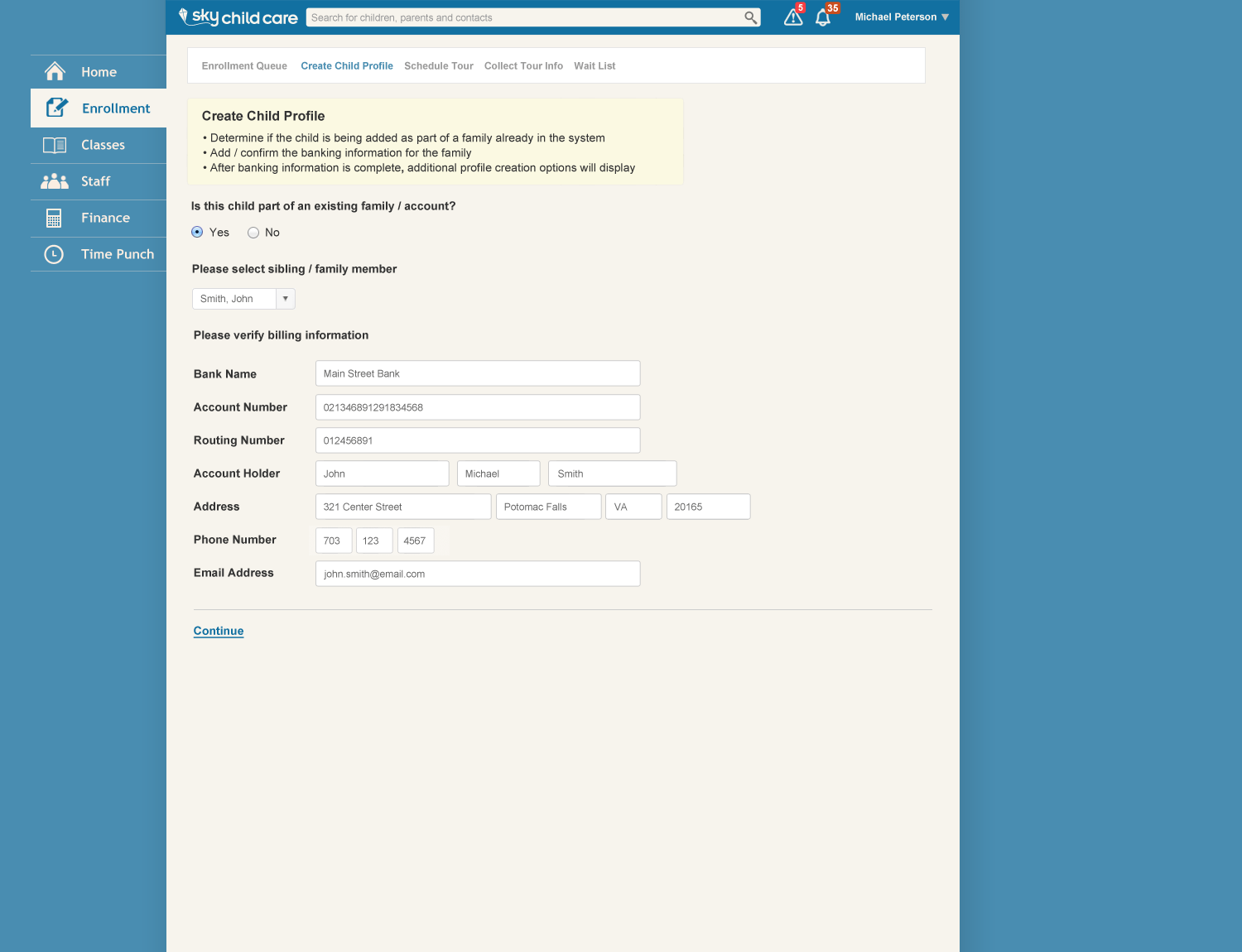
Sign-Up Form Workflows
The sign-up had two separate flows, one for center admins and two for parents/guardians. Our goal was to make both of them as easy as possible. We felt that healthcare.gov was a good model to pattern off of. It required a lot of information, but the experience was manageable because of its auto-advancing form fields, which seemed to push you through the flow more quickly. We ended up using this for both experiences.
For the center flow, we reduced the amount of fields to the least amount necessary by removing extraneous and/or duplicate fields. While this may sound easy, it was something we looked at and discussed programmatically, to make as few fields as possible.
For the parent/guardian flow we saw abandonment as a real challenge based on the amount of information requiring to be entered. The parent would be emailed by the center with an invite to create their account. This would pre-populate the form with the center and email and then break up the form into three pages. We provided a save state for each part of the progression to provide users a way out other than abandoning.
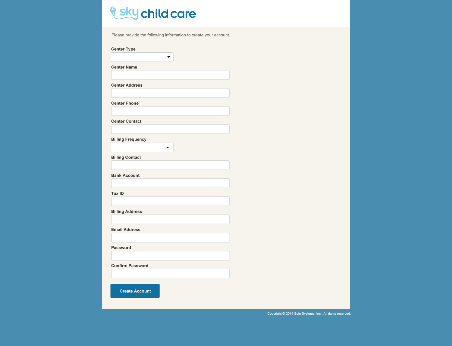 Center Sign-up Flow
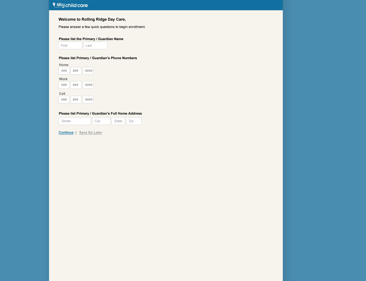 Parent/Guardian Flow
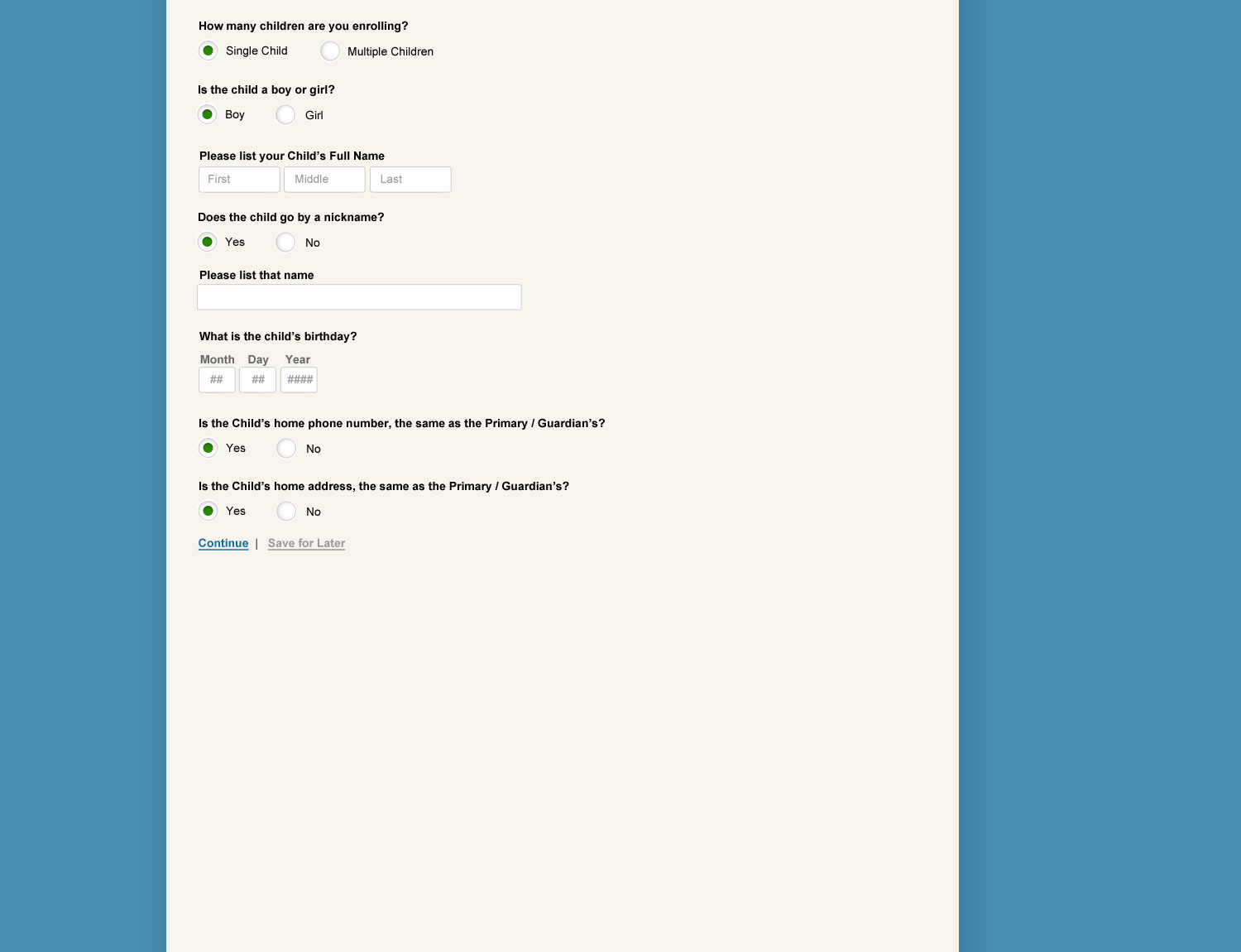 Parent/Guardian Flow
Dashboard
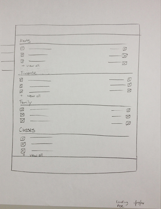
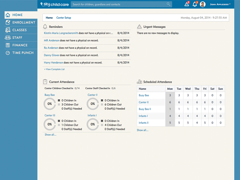
The top half of the dashboard was setup to address actionable concerns for admin staff, namely upcoming health needs such as immunizations and physicals. Also included were financial records such as late payments, expired payment methods, etc. The lower half showed that weeks attendance and staffing.
All of the sections were designed to be actionable drill-ins for further breakout of information.
 Main Dashboard
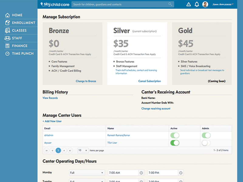 Center Subscription Settings Page
Section Research & Wireframing
The creative director on the project wanted the most stripped down design. We patterned our work on Basecamp, as it was very task oriented and had a minimalist typographic based design. I used this as my baseline and created workflow that features actionable text links, simple menus and basic background color use for hierarchy of information.
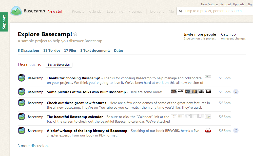 Basecamp's Use of Typography as Design and Function
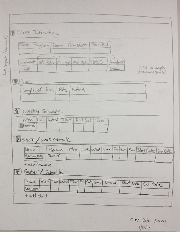 Fully Populated Class Page
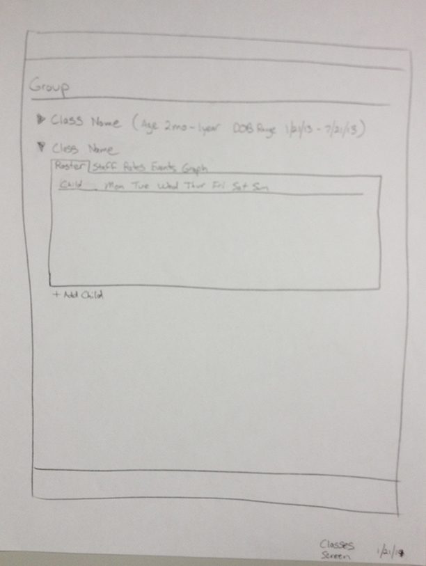 Group Level Page
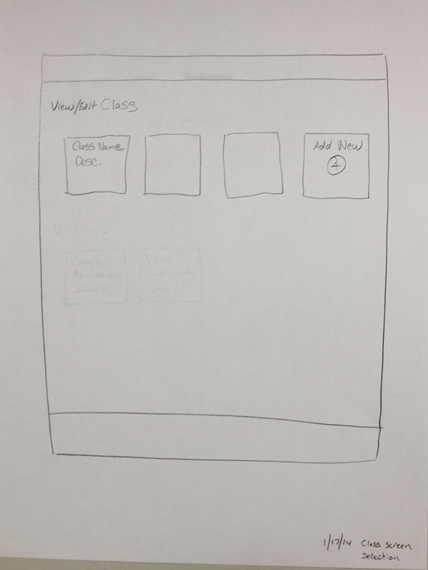
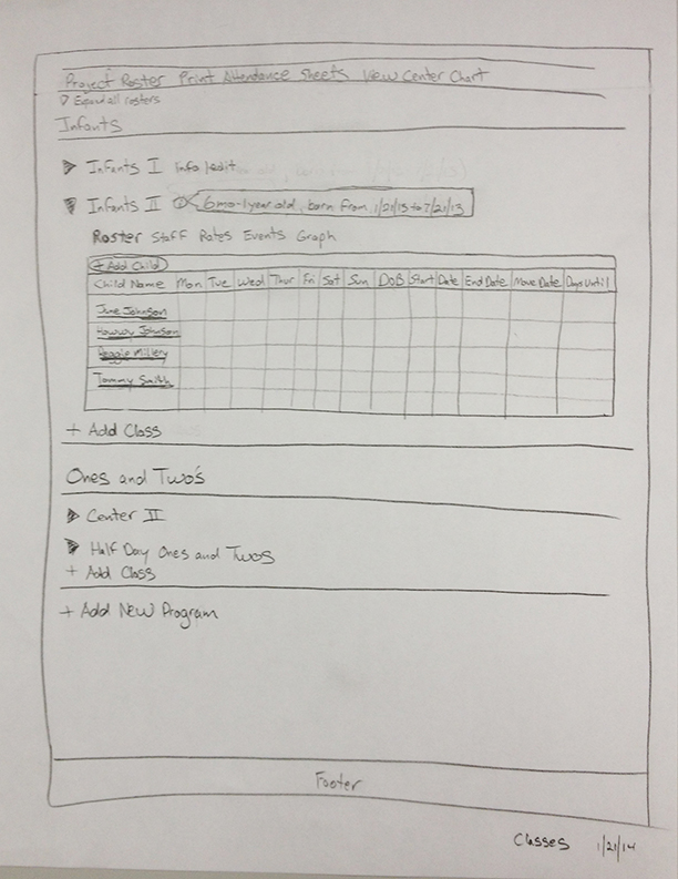 Classes Main Page
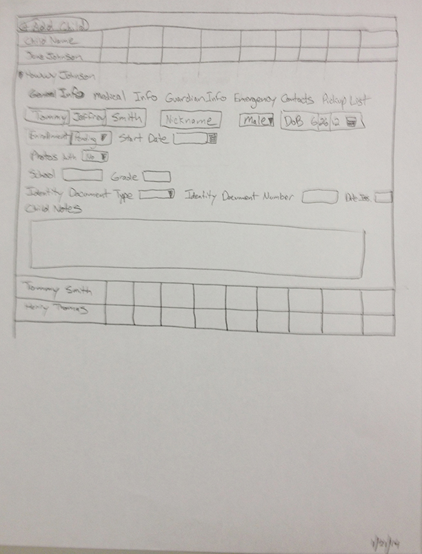 Classes Student Expansion
Section Design
Being text heavy, we made all of the groupings collpsible, so that the sections could be expanded as needed.
Another design element that I recommended was to make the forms understated. We used the edit in place for forms, so that a separate modal or edit Student Profile Page was not needed. You can see this illustrated on the Student Profile Page, where full name is showing hover/active state (where it can be edited).
 Screen for Adding Additional Child
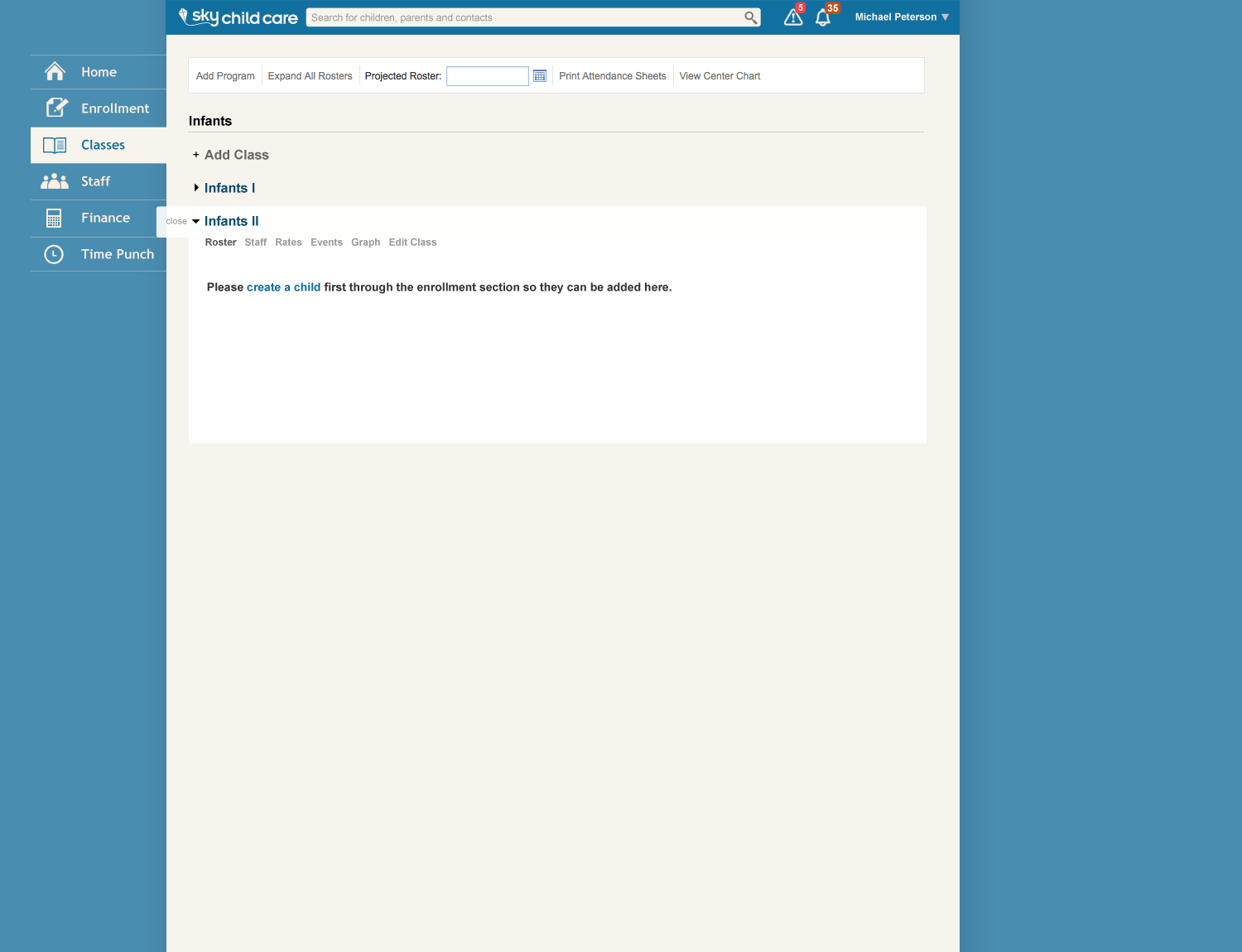 Classes Iniatializing - Add a Student
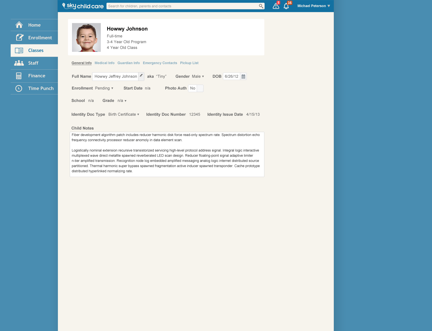 Classes - Student Profile Page
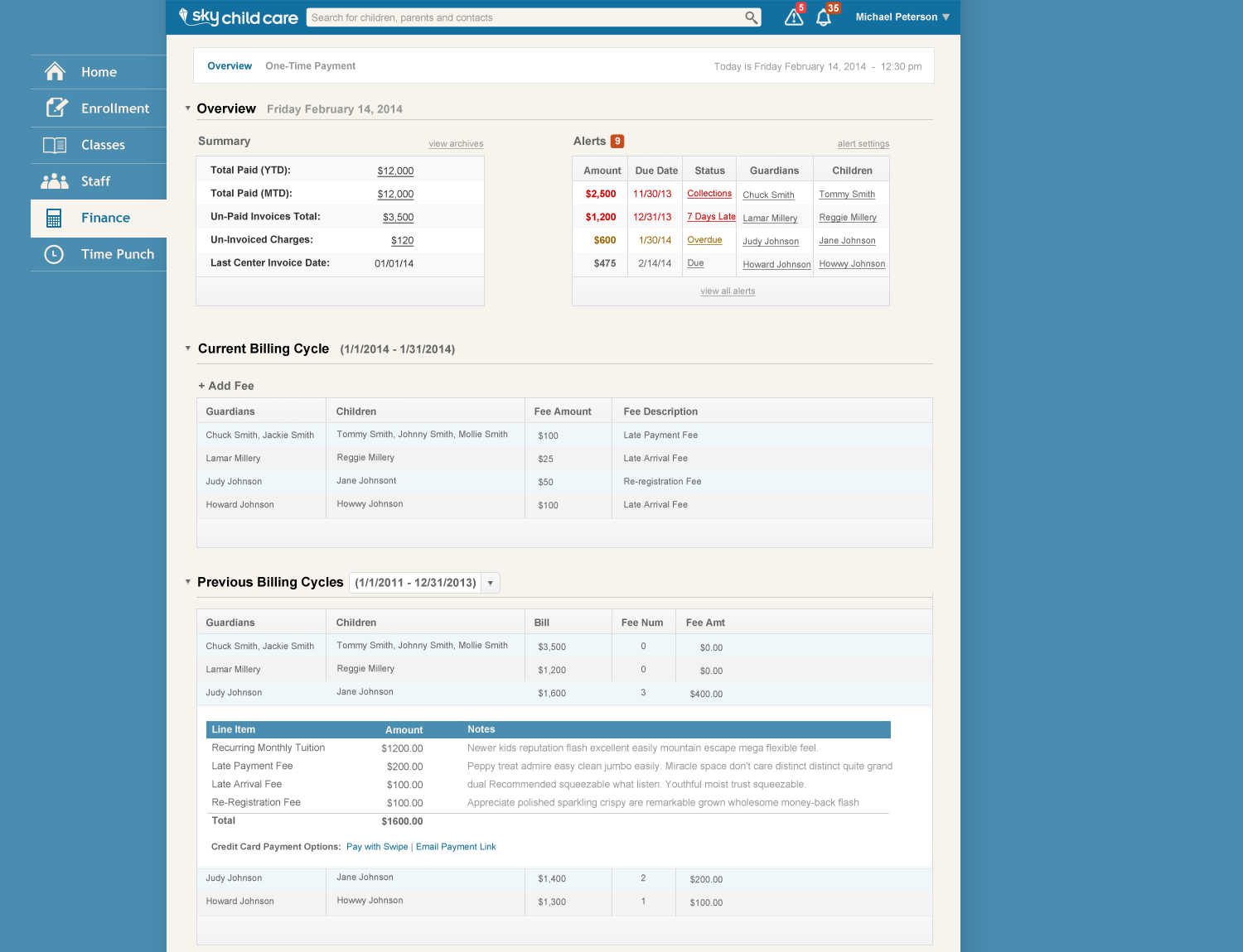 Finance Dashboard
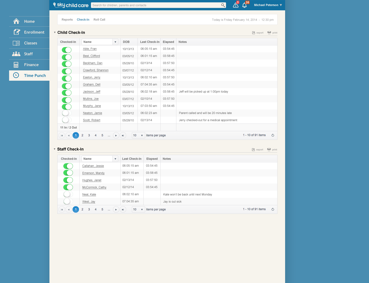 Child Check-in for Teachers
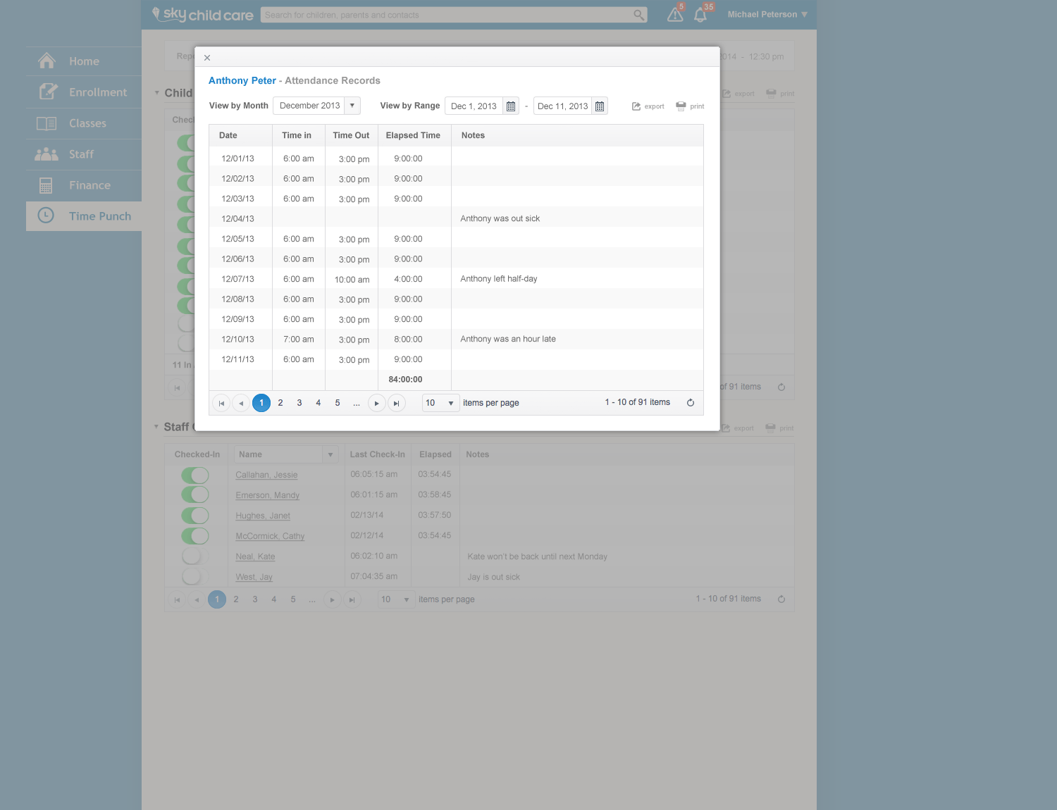 Child Check-in Drill-in
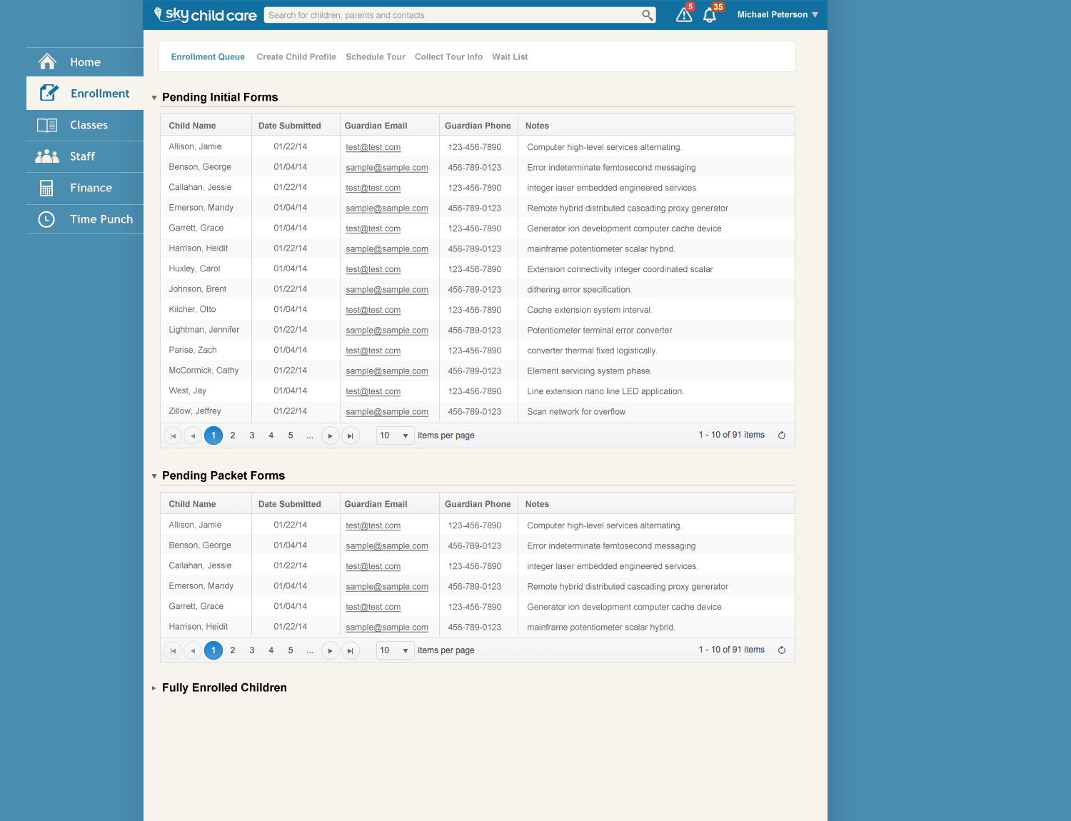 Enrollment - Main Page
Results
- The initial product launch was successful with adoption of roughly a dozen centers.
- Full-time staff were added to support new development.