IT Rangers
(ZenPoint Solutions)
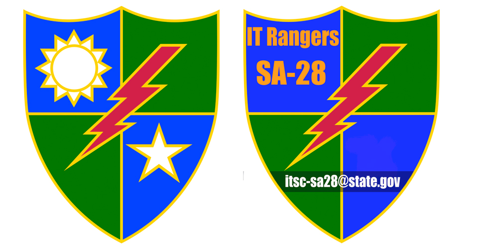
The IT squad at my office likened themselves to the Army's special forces "Rangers." The manager asked me to design something for them. As time allowed, I created a series of designs to provide an identity for them.
Empathy wasn't something I had to research, because I already knew the headaches IT guys typically endure. Having been personally supported and having seen the routine flexibility, weekend work, and many other duties; I knew this was a worthy title. Because of their consistent model of servitude, I was very motivated to create them something special.
My Roles
Logo Designer/Illustrator
Tools and Technologies
Interviewing, Illustrator, Photoshop
Research
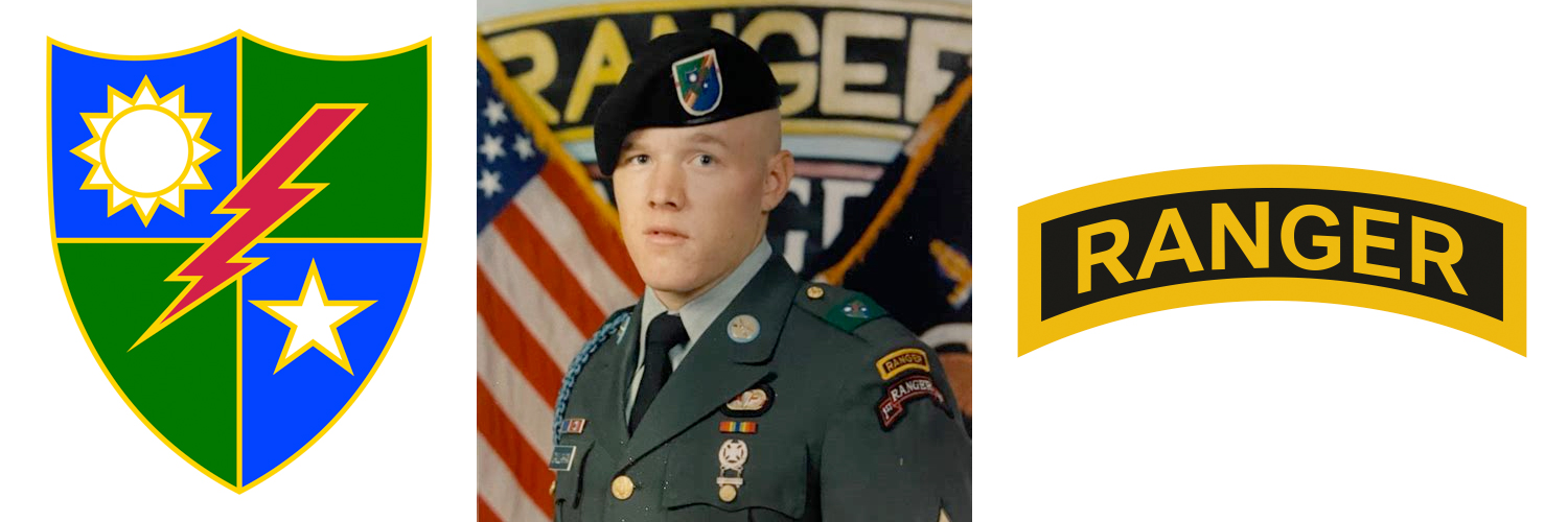
Having been raised in a military family, I knew that the Ranger emblem was a gold outlined arch with the word Ranger inside. When researching the distinctive symbologies, the aformentioned Ranger arch is somewhat limited to being just "Ranger tabbed. Whereas the shield crest is for those who operate within the 75th regiment as official Army Rangers aka "Ranger qualified".
The IT guys incidently had chosen (ripped off) the more precise design even though it was done so more out of ignorance and convenience.
Per my design, the intent was to reuse both the crest and arch shapes and mix those elements with the State Department's brand to create something new.
Having previously met with the State Department's branding contact, I also incorporated some of the brand elements into my thinking.
Initial Drafts
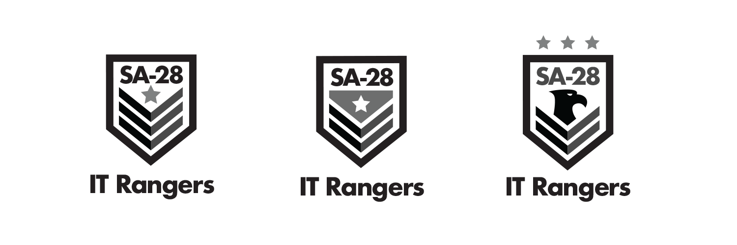
The first drafts were in black and white and were to presented to the team to determine which direction they wanted me to pursue. They selected the 3rd version with the eagle. After letting the design simmer, I really felt the text needed to be amplified, so at that point I integrated the arch design to better support the text.
Final Designs
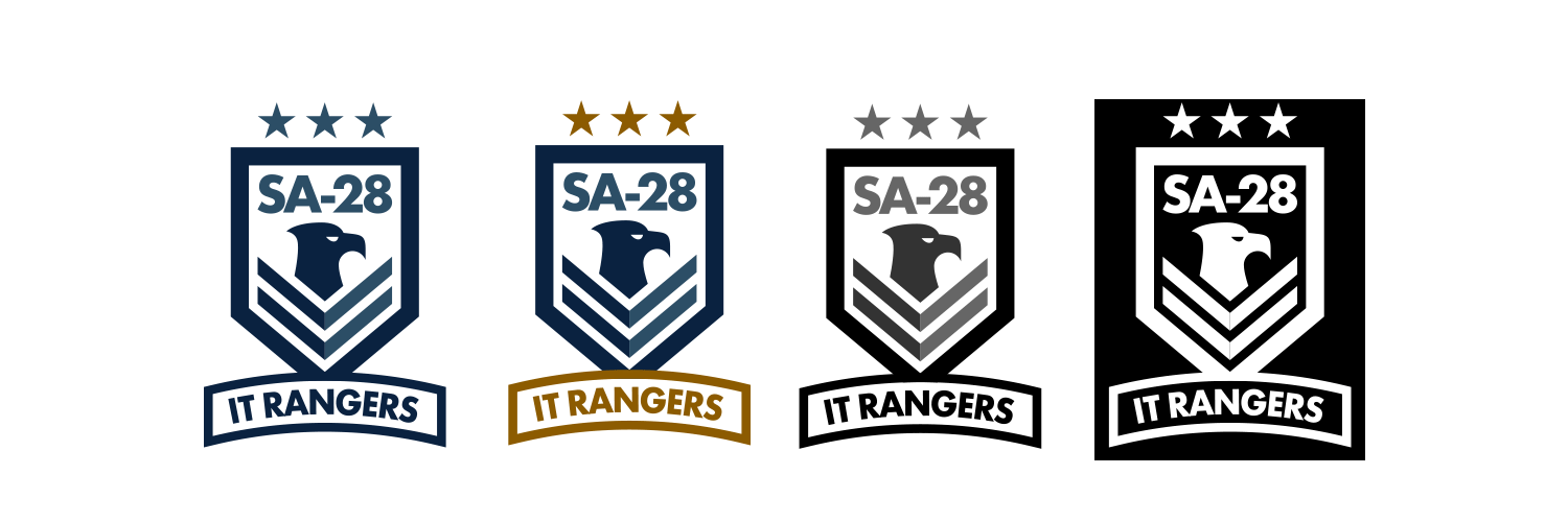
For the finals, I re-rendered the text and applied department derived colors. Included were a blue, mixed color, gray, and reversed in all white.
They ultimately selected the blue version (1st in the list below), but wanted to keep the other versions for perhaps different uses.
Results
- The smiles that I saw from the final logo were reward enough.
- In application, I applied this to lock screen graphics, background wallpapers, and provided the EPS file so they could have team shirts printed.
